Your website has roughly 50 milliseconds to make a first impression. That's faster than a blink. In that fraction of a second, visitors are already forming opinions about your credibility, your brand, and whether they trust you enough to stay.
This isn't just design theory. It directly affects your bounce rate, your conversions, and your bottom line.
Poor design doesn't just look bad it costs you customers. Good design doesn't just look polished, it actively builds trust, reduces friction, and moves people toward action.
This article breaks down exactly how design affects business performance, what high-converting websites actually look like, and what mistakes are silently killing your revenue.
1. Why First Impressions Matter More Than You Think
Research from Google and the University of Basel found that users form visual impressions of a website in as little as 17 to 50 milliseconds and those impressions are highly correlated with whether they perceive the site as credible.
What makes this critical for businesses:
-
First impressions are sticky. Once a user decides a site looks untrustworthy or unprofessional, they rarely revise that opinion mid-session.
-
Visual design drives credibility more than content. A landmark study by Stanford Web Credibility Research found that 75% of users judge a company's credibility based on its website design alone.
-
Bad first impressions mean immediate exits. Users who don't trust what they see will bounce often within 10 seconds.
The implication is clear: design is not decoration. It's your first sales pitch.
2. How Website Design Builds or Destroys Trust
Trust is not abstract. On a website, it's communicated through very specific visual and structural signals. Here's what actually builds it:
Visual Hierarchy
Users shouldn't have to figure out what's important. A clear visual hierarchy using size, contrast, whitespace, and positioning guides their eye to what matters: your headline, your value proposition, your CTA.
When hierarchy is missing, the page feels chaotic, and chaos signals incompetence.
Professional Appearance
Users associate visual polish with business legitimacy. Pixelated images, misaligned elements, inconsistent spacing, and clashing colors all trigger subconscious doubt. Businesses investing in professional UI/UX design services consistently see stronger first-impression metrics.
Consistency
Fonts, colors, button styles, and layout grids should be consistent across every page. Inconsistency creates cognitive friction. Users sense something is "off" even if they can't articulate why.
Mobile Responsiveness
Google reports that more than 60% of web traffic now comes from mobile devices. A site that breaks on mobile tells users you don't care about their experience.
Security Signals
SSL certificates (HTTPS), visible contact information, recognizable payment logos, and privacy policy links all communicate safety. Missing any of these raises red flags especially on ecommerce and lead generation pages.
Clear Navigation
If users can't find what they need in 3 clicks or less, they leave. Navigation should be intuitive, labeled in plain language, and structured around how users think, not how your internal org chart is organized.
Content Readability
Short paragraphs. Adequate line spacing. High contrast between text and background. Font sizes that don't require squinting. These aren't nice-to-haves; they're baseline trust signals.
3. How Poor UX Increases Bounce Rate
Bounce rate is the percentage of visitors who leave after viewing only one page. High bounce rates signal that something in the experience is broken or that the wrong people are arriving. Usually, it's both.
Here's what drives users to bounce:
Slow Loading Speed
Google's research shows that as page load time increases from 1 second to 3 seconds, the probability of bounce increases by 32%. At 6 seconds, that number jumps to 106%.
Speed is not a technical afterthought. It's a UX decision.
Cluttered Layouts
When everything competes for attention, nothing gets it. Cluttered pages overwhelm users and trigger what UX researchers call "cognitive overload" users shut down instead of engaging.
Poor Mobile Experience
Tiny tap targets, horizontal scrolling, text that overflows its container these are mobile UX failures that kill sessions instantly. With mobile-first indexing now standard, poor mobile design hurts both UX and SEO simultaneously.
Confusing Navigation
Nielsen Norman Group research consistently shows that users abandon websites when navigation is unclear or inconsistent (NNGroup, Navigation Research). If your menu labels are creative instead of clear, you're optimizing for ego instead of conversion.
Weak or Missing CTAs
If users don't know what to do next, they do nothing. Weak CTAs buried, vaguely labeled, or visually undifferentiated are one of the most common conversion killers on otherwise decent websites.
Accessibility Issues
Poor color contrast, missing alt text, and non-keyboard-navigable interfaces exclude users with disabilities and also signal low quality to search engines. Web accessibility isn't a compliance checkbox, it's good UX practice.
Intrusive Popups
Popups that fire immediately on page load before the user has read a single sentence are one of the most despised patterns in web UX. They signal desperation, not value.
4. The Connection Between UX and Revenue
Good UX is directly tied to business outcomes. This isn't anecdotal, it's measurable.
Better UX Increases Conversions
Forrester Research has estimated that every $1 invested in UX returns $100 (a 9,900% ROI). While specific numbers vary by context, the directional truth is well-established: reducing friction in user journeys increases the percentage of visitors who take action.
Faster Websites Improve Engagement
Walmart found that for every 1-second improvement in page load time, they saw up to a 2% increase in conversions. A performance-optimized website architecture can significantly improve Core Web Vitals and, with it, both rankings and user engagement.
Simpler Checkout Flows Improve Sales
Baymard Institute's research shows that the average cart abandonment rate is 70.19% (Baymard Institute, 2023). The top reasons? Too many steps, forced account creation, and confusing form design. Streamlined UX fixes this directly.
Clear CTAs Improve Lead Generation
A CTA that is visually prominent, action-oriented, and placed at the right point in the user journey can dramatically improve form fills, demo requests, and purchases. HubSpot research has shown that personalized CTAs convert 202% better than generic ones (HubSpot).
Good Design Reduces Friction
Every extra click, every unclear label, every slow-loading image is friction. Friction kills intent. Good web development services integrate UX thinking into the architecture itself not bolted on afterward.
5. What a High-Converting Website Actually Looks Like
Here's a concrete breakdown of the elements that consistently appear in high-converting websites:
Clear, Specific Hero Section
-
One dominant headline that answers "what is this and why should I care?"
-
A subheadline that adds specificity or proof
-
A single primary CTA not three competing buttons
-
A supporting visual that reinforces the message (not a stock photo of people shaking hands)
Strong, Contextual CTAs
-
Placed where user intent peaks (after the value proposition, after social proof, at the end of key sections)
-
Action-oriented language: "Start Your Free Trial," not "Submit"
-
Visually differentiated from surrounding content
Fast Loading Speed
-
Under 3 seconds on mobile (ideally under 2)
-
Optimized images (WebP format, lazy loading)
-
Minimal render-blocking scripts
-
Clean server response times
Clean, Purposeful Layouts
-
Generous whitespace breathing room aids comprehension
-
Content in digestible chunks
-
No design elements that exist purely for decoration
Mobile-First Design
-
Built for small screens first, scaled up not the reverse
-
Tap targets of at least 44x44px (Apple's HIG standard)
-
Typography that scales properly across breakpoints
Trust Indicators
-
SSL (HTTPS) table stakes
-
Visible contact details (phone, email, address where applicable)
-
Money-back guarantees, return policies visible before purchase decisions
-
Security badges near payment fields
Social Proof
-
Real testimonials with names, photos, and specific results
-
Case study snippets
-
Client logos (if enterprise)
-
Review platform ratings
Consistent Branding
-
Same typefaces, colors, voice, and visual style across every page
-
Brand elements that feel intentional, not accidental
Readable Typography
-
Body text no smaller than 16px
-
Line height around 1.5-1.6 for readability
-
High contrast (minimum 4.5:1 ratio per WCAG guidelines)
-
No more than 2–3 typefaces in use
Easy Navigation
-
Descriptive labels, not clever ones
-
Maximum 7 primary nav items (Miller's Law)
-
Breadcrumbs on deeper pages
-
Visible search on content-heavy sites
6. Psychological Principles Behind High-Converting Design
Understanding why design works (or doesn't) gives you a strategic edge:
Visual Hierarchy
The brain processes visual information hierarchically size, contrast, and position signal importance. Design that respects this guides users to conversion without them noticing.
Color Psychology
Colors carry emotional associations. Blue communicates trust (used heavily in banking and healthcare). Orange and red create urgency. Green signals safety and go-ahead. Color choices should be intentional, not arbitrary.
Cognitive Load
The more mental effort a page requires, the less action users take. Every unnecessary choice, complex label, or visual distraction increases cognitive load. Simplicity is a conversion strategy.
F-Pattern Scanning
Eye-tracking research from Nielsen Norman Group shows that users typically read in an F-shaped pattern scanning horizontally at the top, then down the left side (NNGroup Eye Tracking Research). Critical information should live in this zone.
Trust Signals
Humans are wired to look for social proof and authority. Testimonials, awards, client logos, and certifications satisfy this instinct and reduce purchase anxiety.
User Attention Behavior
Attention above the fold is highest. It drops sharply as users scroll. The most critical messages, value propositions, and CTAs should appear high on the page.
7. Website Design Mistakes That Quietly Kill Revenue
These are the issues most businesses don't catch until they check their analytics:
-
Overdesigned layouts - Animation and visual effects that distract rather than assist. Motion should serve communication, not show off.
-
Poor mobile responsiveness - Even one broken element on mobile can destroy a session.
-
Weak typography - Body text that's too small, too light, or too low-contrast forces users to work harder.
-
Inconsistent branding - Different fonts on the homepage vs. landing pages vs. blog signals a lack of polish.
-
Too many CTAs - When everything is a priority, nothing is. One primary action per section.
-
Slow websites - Every extra second costs conversions. Period.
-
Poor accessibility - Low contrast text, missing focus states, and inaccessible forms exclude users and reduce SEO performance.
Many of these issues are solved during a structured website redesign process that audits existing UX patterns before rebuilding.
8. Why SEO and AI Visibility Now Depend on UX
Design and SEO are no longer separate disciplines. Google has made it official: user experience metrics now directly affect search rankings.
Core Web Vitals
Google's Core Web Vitals Largest Contentful Paint (LCP), Cumulative Layout Shift (CLS), and Interaction to Next Paint (INP) are ranking factors. These are UX metrics measured by Google's crawlers (Google Search Central, Core Web Vitals).
-
LCP: How fast does the main content load? (Target: under 2.5s)
-
CLS: Does the layout shift unexpectedly while loading? (Target: under 0.1)
-
INP: How quickly does the page respond to interactions? (Target: under 200ms)
Poor design scores on these metrics = lower rankings.
Mobile Usability
Google uses mobile-first indexing. A non-responsive design or poor mobile UX directly impacts your ability to rank for competitive terms.
Structured, Semantic Content
AI systems (Google AI Overviews, ChatGPT, Gemini, Perplexity) extract and summarize content that is clearly structured. Proper use of heading tags (H1, H2, H3), semantic HTML, and well-organized content improves your chances of being cited in AI-generated answers.
This is what SEO-friendly website development actually means in 2026 and beyond building structure that works for both humans and machines.
Readability for AI Retrieval
Content that is direct, definition-rich, and question-answering in format is more extractable by LLMs. Lists, tables, short paragraphs, and FAQ sections are particularly AI-retrieval-friendly.
User Engagement as a Ranking Signal
Dwell time, pages per session, and scroll depth are behavioral signals that inform search quality algorithms. A well-designed site keeps users engaged longer which feeds back into rankings.
9. Design Comparison: High-Converting vs. Low-Converting Websites
High-Converting Website vs. Low-Converting Website
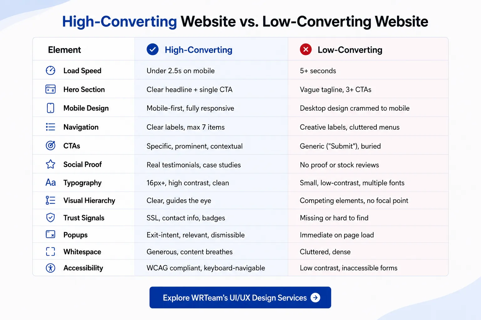
Bounce Rate Factors at a Glance
Design Factors That Increase Bounce Rate:
-
Load time over 3 seconds (+32% to +106% bounce, Google Data)
-
Non-responsive mobile layout
-
Intrusive popups on entry
-
Confusing or missing navigation
-
No clear CTA above the fold
-
Mismatched ad-to-landing-page messaging
Design Factors That Reduce Bounce Rate:
-
Fast load times (under 2.5s)
-
Clear value proposition in the hero section
-
Mobile-optimized layouts
-
Logical navigation structure
-
Relevant, well-placed internal links
-
Visual consistency that builds immediate trust
Revenue-Impacting UX Elements
|
UX Element |
Revenue Impact |
|---|---|
|
1-second faster load time |
Up to 2% conversion increase (Walmart data) |
|
Simplified checkout flow |
Reduces 70% avg cart abandonment rate (Baymard) |
|
Personalized CTAs |
202% better conversion rate (HubSpot) |
|
Mobile optimization |
Access to 60%+ of web traffic (Google) |
|
Clear trust signals |
Reduces purchase anxiety, increases completion |